Single-cell RNA
Overview
Teaching: 60 min
Exercises: 120 minQuestions
How can I prepare a single-cell dataset for input into analysis?
How can I evaluate the quality of a single-cell RNA-Seq dataset?
How can I visualize a single-cell dataset?
How can I annotate cell types in a single-cell dataset?
Objectives
Apply standard single-cell workflow methods such as QC filtering and normalization given a gene-cell count matrix.
Interpret the visualizations that come with a typical single-cell RNA workflow.
Implement clustering and differential expression methods to classify each cell with the proper cell type label.
Lecture portion
The workshop will include a lecture component of around one hour before the practical session later on.
Slides for this available here.
About this tutorial
This Single-cell RNA (scRNA) workflow is based on this vignette from the Satija lab, the authors of the Seurat software package.
10X Genomics (which makes a popular technology for single-cell sequencing), regularly publishes datasets to showcase the quality of their kits. This is commonly done on peripheral blood mononuclear cells (PBMCs), as these are a readily available source of human samples (blood) compared to other tissues. These samples also contain a set of easily distinguishable, well-annotated cell types (immune cells).
The 10X website provides more information and downloadable files for this dataset here.
Setting up to run this tutorial
Just as you did this morning for the bulk RNA workshop, open two tabs: one with an R notebook, and one with Terminal.
We will use the Terminal tab to download and unpack the data, and then the remainder of this workflow will be in R.
Download and unpack the data
Go to the Terminal tab.
We will be using the filtered gene-cell matrix downloaded from the following link:
https://cf.10xgenomics.com/samples/cell-exp/1.1.0/pbmc3k/pbmc3k_filtered_gene_bc_matrices.tar.gz
Download the tarball with all the files for the expression matrix using the wget command.
wget https://cf.10xgenomics.com/samples/cell-exp/1.1.0/pbmc3k/pbmc3k_filtered_gene_bc_matrices.tar.gz
List the current working directory and see the download.
ls -F
pbmc3k_filtered_gene_bc_matrices.tar.gz
Unpack the archive with tar.
tar -xvf pbmc3k_filtered_gene_bc_matrices.tar.gz
The command tar will print the path of the directories, subdirectories and files it unpacks on the screen.
filtered_gene_bc_matrices/
filtered_gene_bc_matrices/hg19/
filtered_gene_bc_matrices/hg19/matrix.mtx
filtered_gene_bc_matrices/hg19/genes.tsv
filtered_gene_bc_matrices/hg19/barcodes.tsv
Now list the current working directory.
ls -F
You should see a new directory (filtered_gene_bc_matrices/) that was not there before. List that directory (remember to try Tab to autocomplete after typing a few characters of the path).
ls -F filtered_gene_bc_matrices/
hg19/
List the sub-directory under that (remember to bring back the prior command with ↑).
ls -F filtered_gene_bc_matrices/hg19/
barcodes.tsv genes.tsv matrix.mtx
We now have the relative path to the directory with the files we need. We will use this path to load the data into R.
Single-cell workflow in R with Seurat
The following will all be run in the R notebook tab.
Load libraries.
Load all the libraries you will need for this tutorial using the library command. Today we will load Seurat, dplyr, and plyr.
library(plyr)
library(dplyr)
library(Seurat)
Read in counts and create a Seurat object.
Prepare the relative path to the directory with the files needed for the count matrix.
Based on what we saw in the data download section, what is the relative path to the directory with the files matrix.mtx, genes.tsv, and features.tsv files?
Solution
filtered_gene_bc_matrices/hg19
Read in based on the relative path.
Next, we will use the Read10X command to read in the downloaded counts, and CreateSeuratObject to create a Seurat object from this count matrix.
Let’s look at the help message for Read10X.
?Read10X
If we scroll down to the examples section, we get the following:
data_dir <- 'path/to/data/directory'
expression_matrix <- Read10X(data.dir = data_dir)
Let’s do something similar here, but replace ‘path/to/data/directory’ with the appropriate path.
Solution
data_dir = 'filtered_gene_bc_matrices/hg19'
expression_matrix = Read10X(data.dir = data_dir)
Creating the Seurat object
From the Read10X help, the next line in the example was this:
seurat_object = CreateSeuratObject(counts = expression_matrix)
If you ran the previous step as written (creating an object called expression_matrix), you should be able to run this line as-is.
Then, we can proceed with the next steps in this workflow based on our Seurat object being called seurat_object.
Quality control metrics calculation and extraction
Calculating mitochondrial rates
One important metric correlated with cell viability (dead cells have higher rates) is mitochondrial rates, or the percent of reads going to mitochondrial genes.
Here, we will use the PercentageFeatureSet argument to calculate these, and add to the Seurat object.
Generate a help message for this command.
?PercentageFeatureSetIn the example at the bottom, they run the command like so to add a variable called
percent.mtto the object, containing the mitochondrial rates.pbmc_small[["percent.mt"]] <- PercentageFeatureSet(object = pbmc_small, pattern = "^MT-")The pattern argument here means that we sum up the percent of reads going to all genes starting with
MT-, e.g.MT-ND1andMT-CO1.Let’s run this on our object, but replace
pbmc_smallwith the name of the Seurat object you just made in the previous step.Solution
seurat_object[["percent.mt"]] = PercentageFeatureSet(object = seurat_object, pattern="^MT-")QC metrics extraction
Besides the mitochondrial rates we just calculated, the following metrics are also calculated automatically when we create the Seurat object:
- nCount_RNA - Number of total UMIs per cell
- nFeature_RNA - Number of genes expressed per cell
And then based on the code we already ran, we have:
- percent.mt - Mitochondrial rate, aka % of reads in a cell that go to mitochondrial genes
We can extract these metrics from the object by using the
$operator.Let’s extract each of these metrics into a series of new objects. The example below is for
nCount_RNA. Replace the Seurat object name with the name of your object, and the name fornFeature_RNAandpercent.mtas appropriate.nCount_RNA = your_seurat_object_name$nCount_RNASolution
nCount_RNA = seurat_object$nCount_RNA
nFeature_RNA = seurat_object$nFeature_RNA
percent.mt = seurat_object$percent.mt
QC visualization
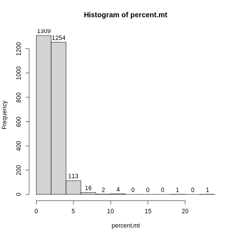
First, let’s plot a simple histogram of percent.mt, with labels.
Here is how we would make a histogram for a variable called “x”.
hist(x,label=TRUE)
Let’s do similar here, but replace percent.mt instead of x.
Solution
hist(percent.mt,label=TRUE)
It looks like there are very few cells with mitochondrial rates over 6%, and especially over 10%.
It is kind of hard to see what it is going on at the lower end of the distribution here, because the breaks in the histogram are driven by the outliers.
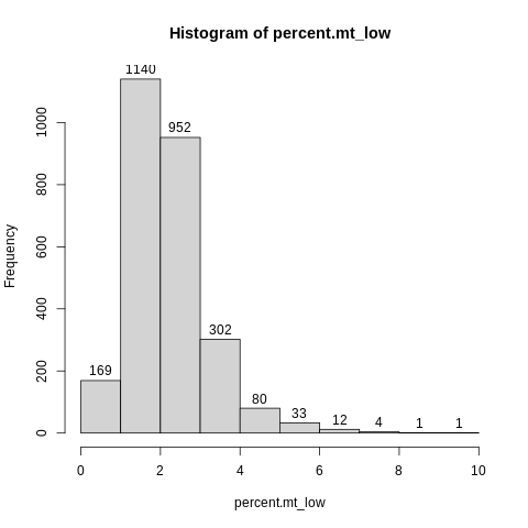
Let’s make another object called “percent.mt_low” that contains only the values less than 10, and then plot a histogram of that.
Example of how to subset an object by value.
x_low = x[x < 5]
We will do similar here, but with “percent.mt” instead of x and 10 instead of 5.
Solution
percent.mt_low = percent.mt[percent.mt < 10]
hist(percent.mt_low,label=TRUE)
Based on this plot, it seems like 5% would potentially be a sensible cutoff on mitochondrial rate.
But let’s make one more plot to see.
Plot nFeature_RNA vs. percent.mt. Make the point size small (cex=0.1) since we have so many points.
plot(nFeature_RNA, percent.mt, cex=0.1)
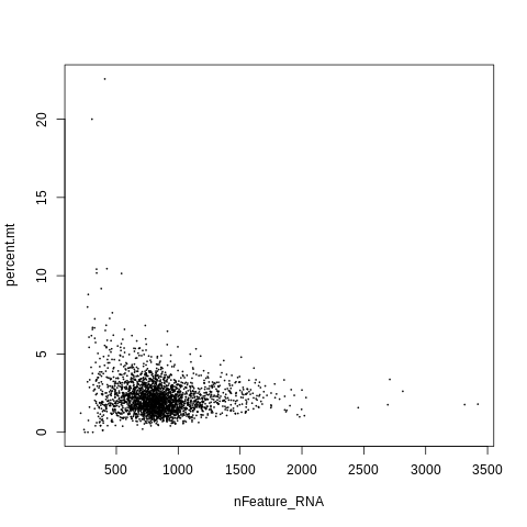
It looks like cells with mitochondrial rates over 5% tend to have very low gene counts, which is another indication of poor quality.
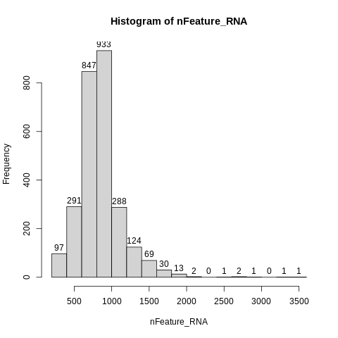
Let’s make a histogram of number of genes (nFeature_RNA) as well. Again, do label=TRUE.
Solution
hist(nFeature_RNA,label=TRUE)
The minimum number of genes is at least 200, which is often where people set a minimum cutoff.
On the other end of the distribution, we find that very few cells have more than 2000 genes, and the max is <= 3600.
One last plot - let’s look at the relationship between number of UMIs (nCount_RNA) and number of genes (nFeature_RNA) per cell.
plot(nCount_RNA,nFeature_RNA,cex=0.1)
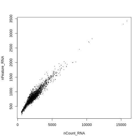
This shows a high level of linear correlation between number of UMIs and number of genes per cell, which is good! Indicates the data is high quality.
QC filtering
Based on the plots in the previous module, we are going to remove cells with mitochondrial rate less than 5% (require
percent.mt < 5).How do we do this? Let’s look up the
subsetfunction, which is a method for a Seurat object.?SeuratObject::subsetSyntax from the help message:
subset(x = seurat_object_name, subset = insert_argument_here)Example from the help message:
subset(pbmc_small, subset = MS4A1 > 4)Replace
pbmc_smallhere with the name of your Seurat object, andMS4A1 > 4with an expression to requirepercent.mtto be less than 5.your_seurat_object_name = subset(x = your_seurat_object_name, subset = your_logical_expression)Solution
seurat_object = subset(x = seurat_object, subset = percent.mt < 5)
Data normalization, variable feature selection, scaling, and dimensional reduction (PCA)
Next, we need to run the following steps:
- Normalize the data by total counts, so that cells with more coverage/RNA content can be made comparable to those with less. Also log-transform. This is done using the
NormalizeDatacommand in Seurat. - Choose a subset of genes with the most variability between cells, that we will use for downstream analysis. This is done using the
FindVariableFeaturescommand in Seurat. - Z-score (scale) the expression within each gene, for all genes in the subset from step 2. This is done using the
ScaleDatacommand in Seurat. - Run dimensional reduction (PCA) on the matrix from step 3. This is done using the
RunPCAcommand in Seurat.
Step summary
NormalizeDataFindVariableFeaturesScaleDataRunPCA
And we will just use default arguments for all of these.
Running commands on an object
This is the syntax to run a set of commands like this on an object, and add the results to the existing object:
your_object_name = command1(object=your_object_name)
your_object_name = command2(object=your_object_name)
your_object_name = command3(object=your_object_name)
your_object_name = command4(object=your_object_name)
In this lesson you will read the R package Seurat’s’ help menus and replace the example syntax above with the Seurat commands. Then replace the object name with the name of the object you have made.
Solution
seurat_object = NormalizeData(object = seurat_object)
seurat_object = FindVariableFeatures(object = seurat_object)
seurat_object = ScaleData(object = seurat_object)
seurat_object = RunPCA(object = seurat_object)
Run and plot non-linear dimensional reduction (UMAP/tSNE)
PCA can help reduce the number of dimensions that explain the data from thousands (of genes) to a handful or tens.
For visualization purposes, though, we need to be able to have a two-dimensional representation of the data.
This is where non-linear techniques like tSNE and UMAP come in. Here, we will use
UMAP, with the principal component coordinates as input.Let’s look at the help message for the command
RunUMAP.?RunUMAPScroll down to the example.
# Run UMAP map on first 5 PCs
pbmc_small <- RunUMAP(object = pbmc_small, dims = 1:5)
Main decision to make here is how many principal components to use.
In the example, they used 5. However this is very low - using the first 10 PCs is more typical for a dataset of this size.
Here, replace
pbmc_smallwith the name of your Seurat object name, and run on the first 10 PCs instead of the first 5.Solution
seurat_object = RunUMAP(object = seurat_object, dims = 1:10)There is also a command to plot the UMAP in the example.
From the example:
DimPlot(object = pbmc_small,reduction = 'umap')Replace the object name in this example with our Seurat object name, which will output a plot.
Solution
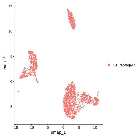
DimPlot(object = seurat_object, reduction = 'umap')
It looks like there are probably at least 3 major clusters in this data. But right now, we have not calculated those clusters yet. We will do so in the next step.
Cluster the cells
Seurat applies a graph-based clustering approach, which means that clustering requires two steps. First, we run the FindNeighbors command, which means that we calculate the distance between each cell and all other cells, and obtain the “k” nearest neighbors for each cell from these distances. Then, we use this information to obtain the clusters using the FindClusters command, where the “resolution” parameter tunes the number of clusters to be reported (higher resolution = more clusters).
Just like the UMAP command, the FindNeighbors command also works on the principal components (PCA) results.
?FindNeighbors
Scroll down to the example, where we see the following:
pbmc_small <- FindNeighbors(pbmc_small, reduction = "pca", dims = 1:10)
We want to use the first 10 PCs as input like we did for RunUMAP, so this command is almost ready to use as-is.
Just replace pbmc_small with the name of your Seurat object.
Solution
seurat_object = FindNeighbors(seurat_object,reduction = "pca", dims = 1:10)
Next, we will run the FindClusters command.
?FindClusters
From this help message, what is the default resolution for this command if you do not specify?
Solution
resolution=0.8
This seems like a good number to start with, as the Seurat documentation says that a resolution < 1 is good for a dataset with ~3000 cells.
Basic syntax of this command is similar to previous, which if we recall is:
your_object_name = yourcommand(object=your_object_name)
Run FindClusters using this syntax.
Solution
seurat_object = FindClusters(object = seurat_object)
Cluster visualization
Now, let’s run the DimPlot command again, which will now by default plot the cluster IDs on the UMAP coordinates.
DimPlot(object = seurat_object,reduction = 'umap')
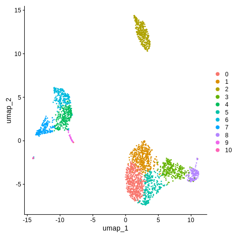
It’s a bit hard to match up the colors to the legend - let’s add argument label=TRUE so we can better see what is going on.
DimPlot(object = seurat_object,reduction = 'umap',label=TRUE)

Looks like we have 11 clusters, some of which appear more distinct than others (from what we can tell from the UMAP).
Cluster annotation using canonical markers
We start with the following sets of markers.
Canonical markers of different broad PBMC cell types
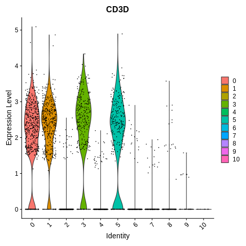
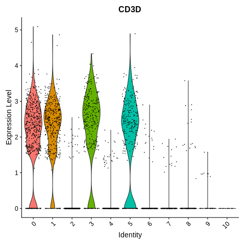
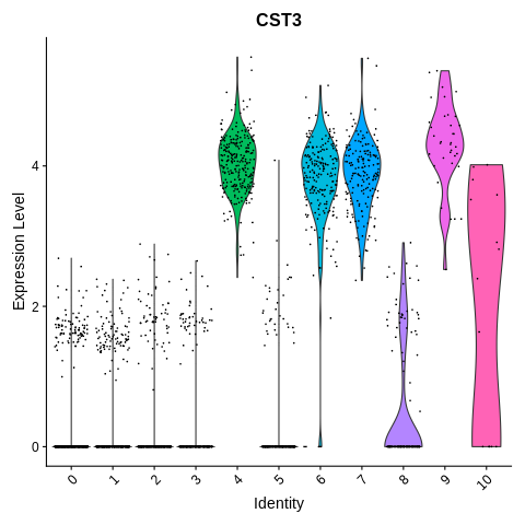
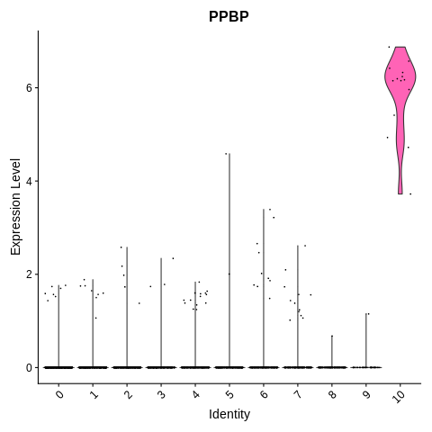
CD3D: Expressed in T cells, including CD4+ and CD8+ T cellsCST3: Expressed in monocytes, dendritic cells (DCs), and plateletsGNLY: Expressed mainly in NK (natural killer) cells; can also sometimes be expressed in a subset of T cellsMS4A1: Expressed in B cellsPPBP: Expressed only in platelets
We will use these markers to annotate the clusters as one of each of the following.
Cluster labels, part 1
TMono/DC: Monocytes and dendritic cellsNKBPlatelet
Let’s make a violin plot of the expression levels of each of the marker genes.
First, pull up the help message for the violin plot command (VlnPlot).
?VlnPlot
In the example section, we find the following:
VlnPlot(object = pbmc_small, features = 'PC_1')
VlnPlot(object = pbmc_small, features = 'LYZ', split.by = 'groups')
We find that we can make a plot of either other variables like a principal component (PC_1), or expression of a gene (like LYZ).
Let’s run this command to plot the expression of the first marker, CD3D. Replace ‘pbmc_small’ with the name of our Seurat object, and ‘PC_1’ with the name of the gene of interest.
Solution
VlnPlot(object = seurat_object, features = 'CD3D')
How many clusters seem to be some kind of T cell based on this plot, and which ones?
Solution
4 clusters -
0,1,3, and5
We can add “+ NoLegend() at the end of the command, like so, to remove the legend which isn’t really necessary here.
Solution
VlnPlot(object = seurat_object, features = 'CD3D') + NoLegend()
Let’s repeat the same plotting command now, but for each of the remaining marker genes.
Then, as you generate each plot, note which clusters have high expression of the gene, and therefore which cell type they might be.
Mono/DC and platelet cluster annotation
Click the first solution below for command to plot the mono/DC marker, and a rendering of the plot.
Solution
VlnPlot(object = seurat_object, features = 'CST3') + NoLegend()
Click the second solution below for interpretation of this plot.
Solution
Clusters 4, 6, 7, 9, and 10 seem to be either mono/DC or platelets.
Click the third solution below for command to plot the platelet marker, and a rendering of the plot.
Solution
VlnPlot(object = seurat_object, features = 'PPBP') + NoLegend()
Click the fourth solution below for interpretation of this plot.
Solution
Cluster 10 seems to be platelets. Which means that clusters 4,6,7, and 9 are mono/DC.
NK and B cell cluster annotation
Plot the NK cell marker in a violin plot.
What does this tell us about which cluster(s) might be NK cells?
Solution
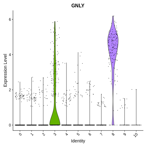
VlnPlot(object = seurat_object, features = 'GNLY') + NoLegend()
Clusters 3 and 8 have high expression of GNLY.
However going back to the T cell marker (CD3D) plot, cluster 3 is T cells. So, that leaves cluster 8 as NK cells.
Finally, plot the B cell marker in a violin plot, and use this to say which cluster(s) might be B cells?
Solution
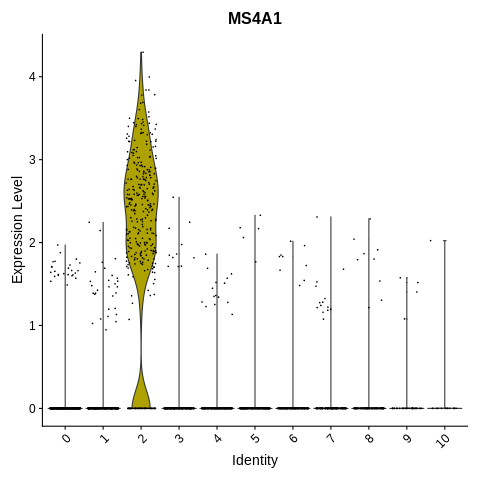
VlnPlot(object = seurat_object, features = 'MS4A1') + NoLegend()
This one’s nice and straightforward! Cluster 2 is B cells, as it is the only cluster with any substantial proportion of cells expressing MS4A1.
So, to summarize, which clusters are each of the 5 broad cell types we are looking for?
Solution
T: Clusters 0,1,3,5Mono/DC: Clusters 4,6,7,9NK: Cluster 8B: Cluster 2Platelet: Cluster 10
Let’s relabel each cluster according to its broad cell types.
For broad cell types with multiple clusters, call them e.g. T_1, T_2, etc.
Relabel each cluster based on its broad cell types.
Example labels for a brain dataset:
Neuron: Clusters 0,1,5,7Astrocyte: Clusters 2,4Oligodendrocyte/OPC: Clusters 3,6Microglia: Cluster 8Code below to remap the clusters, and output a new plot with the updated cluster labels.
Note, it is important to put the cluster IDs in single quotes! Otherwise for example,
1might pull out the first level (which is cluster 0).old_cluster_ids = c('0','1','5','7','2','4','3','6','8') new_cluster_ids = c('Neuron_1','Neuron_2','Neuron_3','Neuron_4', 'Astrocyte_1','Astrocyte_2', 'Oligo/OPC_1','Oligo/OPC_2', 'Microglia') clusters = Idents(seurat_object) clusters = mapvalues(x = clusters, from = old_cluster_ids, to = new_cluster_ids) #The following is not strictly necessary, but let's also save the new cluster names as a variable called "cluster_name" in the object. seurat_object$cluster_name = clusters #Reassign the ID per cell to the cluster name instead of number. Idents(seurat_object) = clustersReplace this code with the cluster IDs and new names we just determined for this dataset (change the lines where you set
old_cluster_idsandnew_cluster_ids).Solution
old_cluster_ids = c('0','1','3','5',
  '4','6','7','9',
  '8','2','10')

new_cluster_ids = c('T_1','T_2','T_3','T_4',
  'Mono/DC_1','Mono/DC_2','Mono/DC_3','Mono/DC_4',
  'NK','B','Platelet')

clusters = Idents(seurat_object)

clusters = mapvalues(x = clusters,
  from = old_cluster_ids,
  to = new_cluster_ids)

seurat_object$cluster_name = clusters

Idents(seurat_object) = clusters
If you make a mistake and you want to reset to the old cluster IDs, here is code for how to fix it.
Then, you can re-run the code in the solution above.
Idents(seurat_object) = seurat_object$RNA_snn_res.0.8
Let’s redo the DimPlot command and see how it looks with the new, more descriptive labels.
DimPlot(object = seurat_object,reduction = 'umap',label=TRUE)
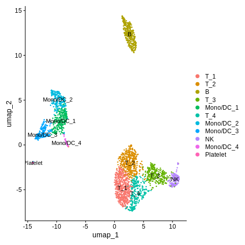
This is much improved!
Next, we are going to see if we can look at additional markers to distinguish subsets of the T cell and the Mono/DC broad cell types.
We are interested in distinguishing the following subtypes.
Cluster labels, part 2 (subtypes)
CD4+ TandCD8+ T: Two different T cell subtypesCD14+ MonocyteandFCGR3A+ Monocyte: Two different subtypes within the “Mono” subset of the “Mono/DC” clustersDendritic cell: The “DC” subset of the “Mono/DC” clusters
To distinguish these, let’s check the following markers.
Canonical markers, part 2 (subtype markers)
CD4andCD8: As the name suggests, “CD4+” T cells have high levels of CD4 protein, while “CD8+” cells have high levels of CD8 protein.FCER1A: Marker of dendritic cellsCD14andFCGR3A: Again, the proteins we expect high levels of are in the name.
We can plot two or more different genes at once in violin plot like so.
mygenes = c('Gene1','Gene2')
VlnPlot(seurat_object,features = mygenes) + NoLegend()
Let’s do this for CD4 and CD8 to start.
Distinguishing CD4+ vs. CD8+ T cell subsets
Solution
mygenes = c('CD4','CD8')
VlnPlot(seurat_object,features = mygenes) + NoLegend()
Warning message: The following requested variables were not found: CD8
Whoops! Forgot that the gene name for CD8 is actually CD8A. Just plain CD8 is the name for the protein.
Let’s try that again. Plot a violin plot of CD4 and CD8A genes.
Solution
mygenes = c('CD4','CD8A')
VlnPlot(seurat_object,features = mygenes) + NoLegend()
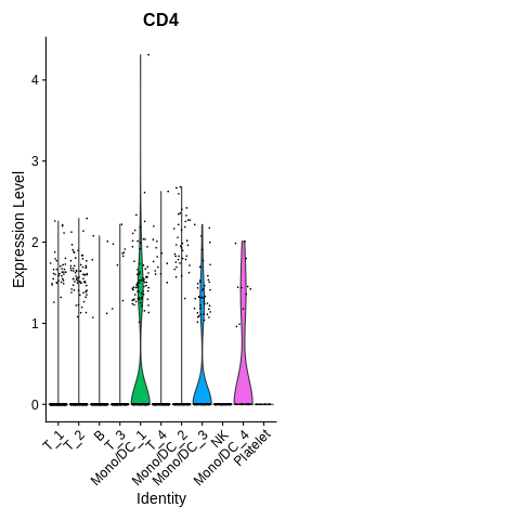
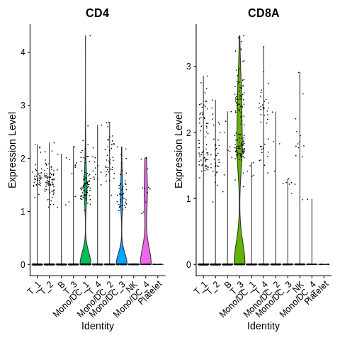
How do we interpret this plot?
We find that cluster T_3 seems to have high expression of CD8A.
Weirdly, none of the T cell clusters seem to have high expression of CD4.
If anything, we see a bit of expression in the Mono/DC clusters, but almost none in any of the T cell clusters.
What is going on with that?
Well, CD4 protein is expected to be high in CD4+ T cells, but not necessarily the RNA.
However, we can reasonably assume here that the T cell clusters without CD8A gene expression, are likely that way because they are CD4+ instead.
Let’s rename cluster ‘T_3’ to ‘CD8T’, and clusters ‘T_1’, ‘T_2’, and ‘T_4’ to ‘CD4T_1’, ‘CD4T_2’, and ‘CD4T_3’, the same way we renamed clusters previously.
Solution
old_cluster_ids = c('T_3','T_1','T_2','T_4')
new_cluster_ids = c('CD8T','CD4T_1','CD4T_2','CD4T_3')

clusters = Idents(seurat_object)
clusters = mapvalues(clusters,from=old_cluster_ids,to=new_cluster_ids)

Idents(seurat_object) = clusters
Let’s plot yet again.
DimPlot(object = seurat_object,reduction = 'umap',label=TRUE)
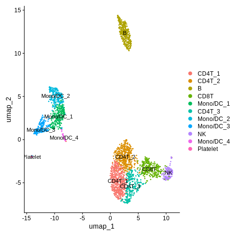
Looks great! Nice that we got the CD4 vs. CD8 T-cell annotation figured out.
Distinguishing monocyte and DC subsets
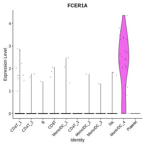
On to the remaining markers. Let’s plot FCER1A.
VlnPlot(seurat_object,features='FCER1A') + NoLegend()
And CD14 vs. FCGR3A.
mygenes = c('CD14','FCGR3A')
VlnPlot(seurat_object,features=mygenes) + NoLegend()
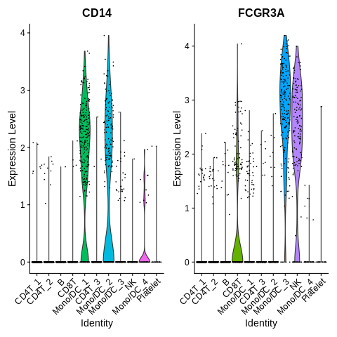
It looks like annotation should mostly be pretty straightforward here.
Except, it seems that FCGR3A is not totally just a FCGR3A+ monocyte marker, as it is also highly expressed in NK cells.
Let’s also plot another marker of FCGR3A+ monocytes, MS4A7, to make sure we are annotating correctly.
VlnPlot(seurat_object,features='MS4A7') + NoLegend()
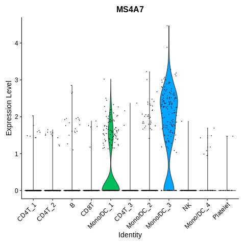
Cluster Mono/DC_3 also has high expression of this gene, in addition to the high expression of FCGR3A.
I think we are safe to label this cluster as FCGR3A+ Monocytes.
Let’s label clusters ‘Mono/DC_1’ and ‘Mono/DC_2’ as ‘CD14_Mono_1’ and ‘CD14_Mono_2’.
Cluster ‘Mono/DC_3’ as ‘FCGR3A_Mono’.
And cluster ‘Mono/DC_4’ as ‘DC’.
Solution
old_cluster_ids = c('Mono/DC_1','Mono/DC_2','Mono/DC_3','Mono/DC_4')

new_cluster_ids = c('CD14_Mono_1','CD14_Mono_2','FCGR3A_Mono','DC')

clusters = Idents(seurat_object)
clusters = mapvalues(x=clusters,from=old_cluster_ids,to=new_cluster_ids)

Idents(seurat_object) = clusters
Make UMAP plot again.
DimPlot(object = seurat_object,reduction = 'umap',label=TRUE)
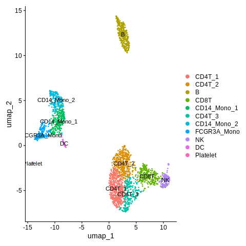
Let’s also save all these cluster names as a variable “cluster_name” within the Seurat object again.
This way, we will still have them in case we redo clustering.
seurat_object$cluster_name = Idents(seurat_object)
Re-clustering
So, the only thing about the UMAP plot above is, it seems we may have set the resolution a bit too high.
We were not expecting three different clusters of CD4+ T cells - at most we were expecting two.
Let’s try to redo the FindClusters command with a lower resolution value.
Remember, here is the command we ran previously (argument resolution=0.8 not explicitly stated previously, but it was included by default):
seurat_object = FindClusters(seurat_object,resolution=0.8)
Let’s do this again, but let’s set resolution=0.5 instead.
Solution
seurat_object = FindClusters(seurat_object,resolution=0.5)
Plot the new cluster IDs in a UMAP plot again (same command as before).
DimPlot(object = seurat_object,reduction = 'umap',label=TRUE)
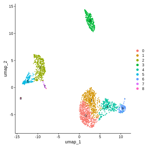
Referring back between this plot and the one before, we can re-label each of the new clusters using the same strategy we have been doing.
We now only have one cluster for CD14+ Monocytes instead of two, and two clusters for CD4+ T cells instead of three.
Solution
old_cluster_ids = c('0','1','4','6',
  '2','5','7',
  '3','8')

new_cluster_ids = c('CD4T_1','CD4T_2','CD8T','NK',
  'CD14_Mono','FCGR3A_Mono','DC',
  'B','Platelet')

clusters = Idents(seurat_object)
clusters = mapvalues(x=clusters,from=old_cluster_ids,to=new_cluster_ids)

Idents(seurat_object) = clusters
Let’s plot.
DimPlot(object = seurat_object,reduction = 'umap',label=TRUE)
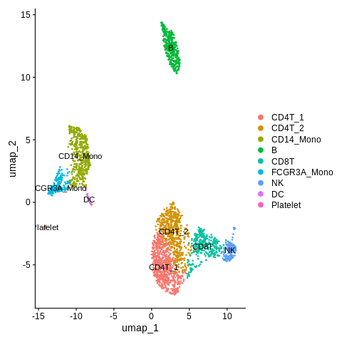
Mostly looks great! Except, I am wondering what the difference is between CD4T_1 and CD4T_2 clusters.
Let’s figure this out in the next module.
Differential expression between clusters for detailed annotation
We can use the FindMarkers command to run differential expression between groups of cells.
Let’s look at the help message for this command.
?FindMarkers
We find the following example:
markers <- FindMarkers(object = pbmc_small, ident.1 = 2)
Here, we want to run comparison between two clusters, though, so we also need to fill in the “ident.2” argument.
Here is another example from the Seurat website, where they run differential expression between cluster 5 and clusters 0 and 3 for the Seurat object “pbmc”.
cluster5.markers <- FindMarkers(pbmc, ident.1 = 5, ident.2 = c(0, 3))
Here, let’s run differential expression between CD4T_1 and CD4T_2, and save results to an object called CD4T_markers.
Remember here that our object is called seurat_object.
Solution
CD4T_markers = FindMarkers(object = seurat_object,ident.1 = 'CD4T_1',ident.2 = 'CD4T_2')
Let’s look at the first few rows.
head(CD4T_markers)
Should look something like this.
              p_val avg_log2FC pct.1 pct.2    p_val_adj
S100A4 1.119839e-77 -1.5732946 0.663 0.950 3.666129e-73
B2M    1.548560e-47 -0.3917224 1.000 1.000 5.069676e-43
IL32   2.708330e-34 -0.8913577 0.755 0.950 8.866532e-30
RPL32  1.597186e-33  0.3245829 0.998 1.000 5.228868e-29
ANXA1  2.271029e-33 -1.1805915 0.481 0.784 7.434896e-29
MALAT1 3.227506e-33  0.4359386 1.000 1.000 1.056621e-28
Here, a positive value for avg_log2FC means the gene is higher in CD4T_1 than CD4T_2.
While a negative value means the gene is higher in CD4T_2.
Let’s create two versions of this table.
One with only genes that have avg_log2FC > 0, and we’ll call it CD4T1_markers.
And the other with only genes with avg_log2FC < 0, and we’ll call it CD4T2_markers.
Solution
CD4T1_markers = CD4T_markers[CD4T_markers$avg_log2FC > 0,]
CD4T2_markers = CD4T_markers[CD4T_markers$avg_log2FC < 0,]
Next, let’s take the each of each.
head(CD4T1_markers)
              p_val avg_log2FC pct.1 pct.2    p_val_adj
RPL32  1.597186e-33  0.3245829 0.998     1 5.228868e-29
MALAT1 3.227506e-33  0.4359386 1.000     1 1.056621e-28
RPS27  3.128530e-29  0.2888005 0.998     1 1.024218e-24
RPS23  7.596983e-25  0.3204768 1.000     1 2.487100e-20
RPL21  1.258047e-24  0.3233405 0.997     1 4.118594e-20
RPS6   2.552847e-24  0.2700326 1.000     1 8.357510e-20
head(CD4T2_markers)
              p_val avg_log2FC pct.1 pct.2    p_val_adj
S100A4 1.119839e-77 -1.5732946 0.663 0.950 3.666129e-73
B2M    1.548560e-47 -0.3917224 1.000 1.000 5.069676e-43
IL32   2.708330e-34 -0.8913577 0.755 0.950 8.866532e-30
ANXA1  2.271029e-33 -1.1805915 0.481 0.784 7.434896e-29
VIM    4.209886e-32 -0.7634691 0.815 0.941 1.378232e-27
ANXA2  3.870629e-29 -1.6894050 0.158 0.468 1.267167e-24
The genes we see in the first few rows of CD4T1_markers are mostly ribosomal proteins - not the most interesting in terms of biology.
Let’s look at more rows to see if we see anything more interpretable.
head(CD4T1_markers,20)
              p_val avg_log2FC pct.1 pct.2    p_val_adj
RPL32  1.597186e-33  0.3245829 0.998 1.000 5.228868e-29
MALAT1 3.227506e-33  0.4359386 1.000 1.000 1.056621e-28
RPS27  3.128530e-29  0.2888005 0.998 1.000 1.024218e-24
RPS23  7.596983e-25  0.3204768 1.000 1.000 2.487100e-20
RPL21  1.258047e-24  0.3233405 0.997 1.000 4.118594e-20
RPS6   2.552847e-24  0.2700326 1.000 1.000 8.357510e-20
RPL9   4.138263e-23  0.3523786 0.998 0.998 1.354785e-18
RPS3A  1.893362e-20  0.3668490 0.998 1.000 6.198487e-16
RPL31  3.589483e-20  0.2982064 0.997 1.000 1.175125e-15
RPS14  7.514163e-20  0.2502883 1.000 1.000 2.459987e-15
CCR7   7.396108e-19  1.2961428 0.467 0.246 2.421338e-14
RPS13  8.350707e-19  0.2985510 0.989 0.987 2.733855e-14
RPL13  1.203840e-18  0.2420806 1.000 1.000 3.941133e-14
RPL11  5.276883e-15  0.2304492 1.000 1.000 1.727546e-10
RPL30  7.408685e-15  0.2386593 1.000 1.000 2.425455e-10
RPS28  1.996393e-14  0.2641382 0.992 0.992 6.535791e-10
RPS16  2.500937e-14  0.2595951 0.997 0.998 8.187568e-10
RPLP2  3.838422e-14  0.2096304 1.000 1.000 1.256623e-09
RPL19  1.000814e-13  0.1726900 0.998 1.000 3.276464e-09
RPS25  1.027298e-13  0.2320915 0.998 0.998 3.363167e-09
We find a gene called CCR7 is upregulated in CD4T_1.
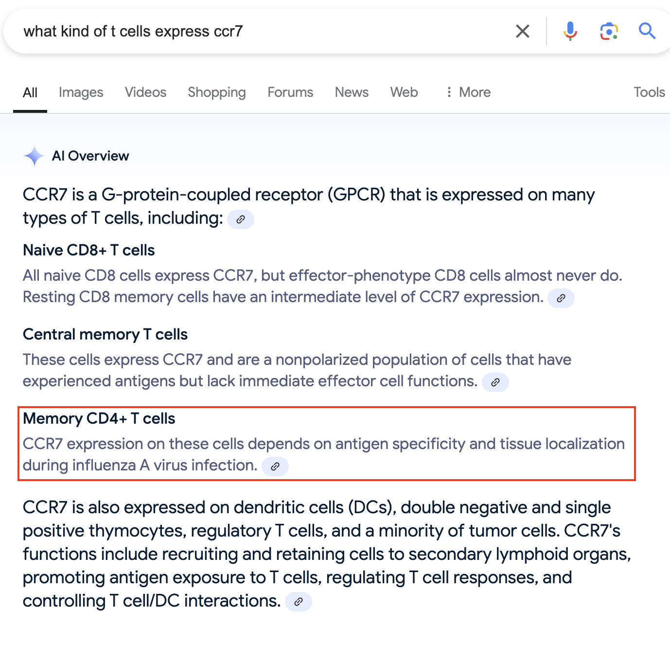
Let’s say we didn’t know a lot about the biology here. Maybe we can Google it and see what comes up?
One solution below - but you may word your search differently!
Solution
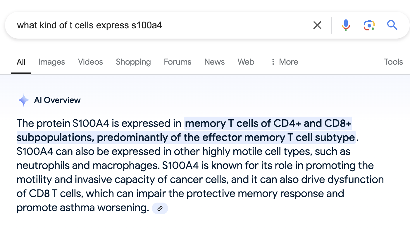
We also find that a gene called S100A4 is the top most significantly upregulated gene in CD4T_2.
Let’s try a search again. One possibly search query below.
Solution
Well, that is not the most helpful. Seems like both of these genes can be expressed in memory CD4+ T cells?
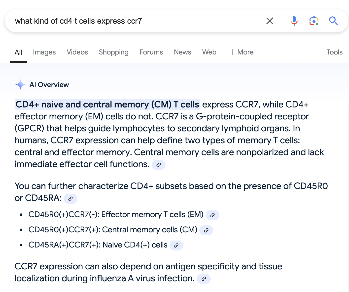
What if we edit the search to specifically focus on CD4+ T cells, not just all T cells? Maybe that will help?
Solution
OK, so it looks like Ccr7 can be expressed in either naive CD4+ T cells, or specifically central memory T cells.
While effector memory T cells do not express this gene.
This also makes sense with what we saw when we searched for S100A4, which is expressed specifically in effector memory T cells.
If we search for more info on naive vs. memory T cells, we also find this paper, which seems to confirm the initial Google AI overview, so we aren’t just relying on that.
Let’s annotate these clusters based on this (CD4T_1 = Naive_or_central_memory_CD4T, CD4T_2 = Effector_memory_CD4T), but put a “?” since it’s a bit iffy compared to the other cluster annotation.
In a real-world analysis, this would often be the time to do a deeper literature review, or consult a collaborator with more knowledge of the biology to confirm this preliminary annotation.
old_cluster_ids = c('CD4T_1','CD4T_2')
new_cluster_ids = c('Naive_or_central_memory_CD4T?','Effector_memory_CD4T?')

clusters = Idents(seurat_object)
clusters = mapvalues(x=clusters,from=old_cluster_ids,to=new_cluster_ids)

Idents(seurat_object) = clusters
Final plot:
DimPlot(object = seurat_object,reduction = 'umap',label=TRUE)
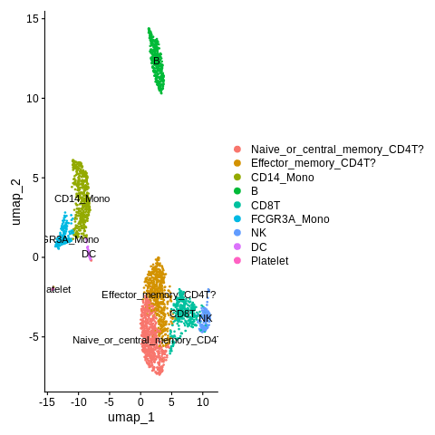
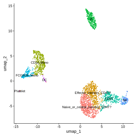
Also think we can remove the legend here.
DimPlot(object = seurat_object,reduction = 'umap',label=TRUE) + NoLegend()
Key Points
Single-cell RNA analysis often starts with a gene-cell count matrix.
QC metrics used for understanding and filtering data quality include mitochondrial rate and number of genes.
Processing stages in a scRNA workflow includes normalization, feature selection, scaling, and dimensional reduction.
Clustering is a key step in understanding biology.
We can use known marker genes or run differential expression between clusters to annotate cell types after clustering.
Annotation often requires starting with broad cell types, then moving to more specific.
